2008 SEO Poker Tournament T-Shirts – Help Me!
Howdy!
In case you didn’t know, we are having a poker tournament!
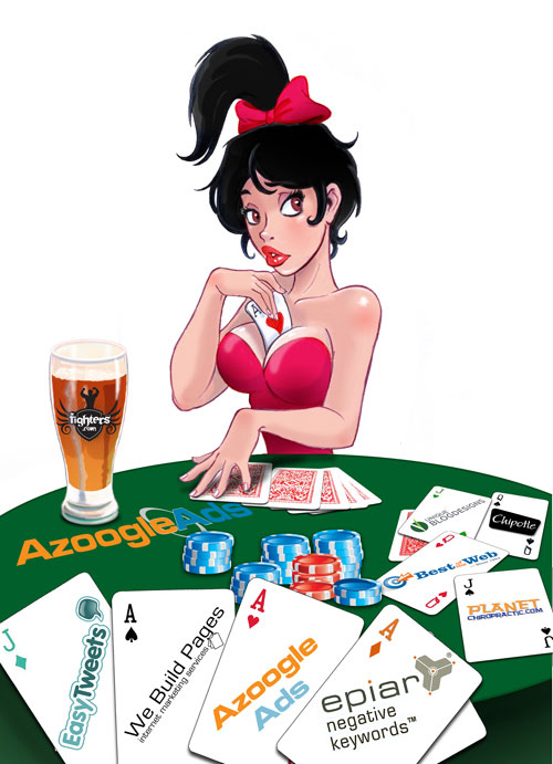
The great news is that the Venetian is busting their behind to get us approved so it will be a charity tournament, and it looks like it probably will be. It will be up to the Venetian now!
The above is the final graphic for the poker tournament.
I and another designer have had our hand in it too, but it is 98% Dean!
Now we have to choose the colors. The graphic will go on the back, but these show it on the front. All American Apparel t-shirts.
Take a look at the options, and then I am going to ask you to vote.
In reality the colors will not be as bright, or as clear on a t-shirt.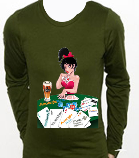
This first one was olive.
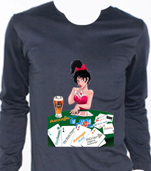
This one is asphalt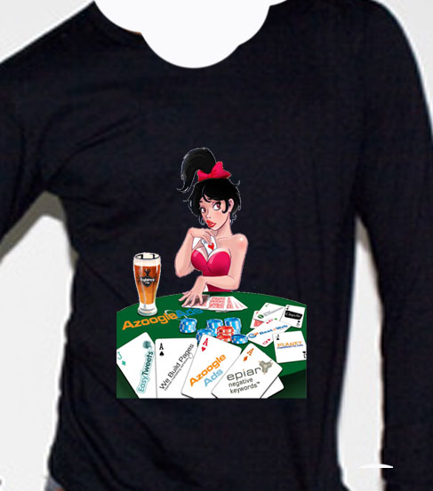
This one is black.
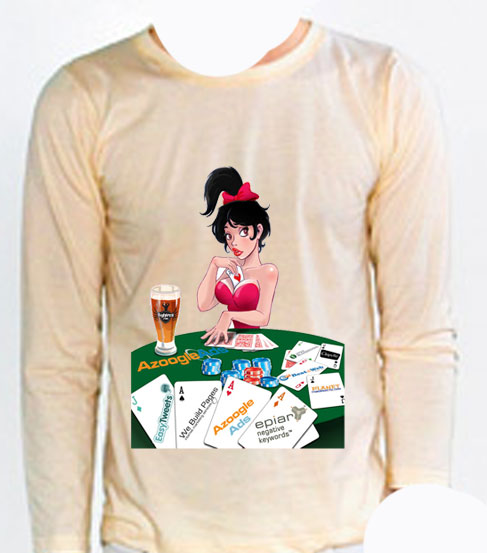
This one is natural color.
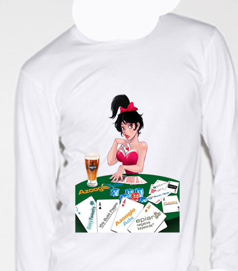
This one was white.
NEXT QUESTION
Should we put this emblem on the chest?
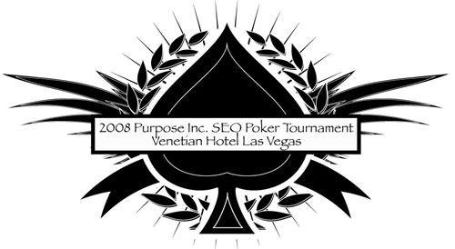
THIRD AND LAST QUESTION:
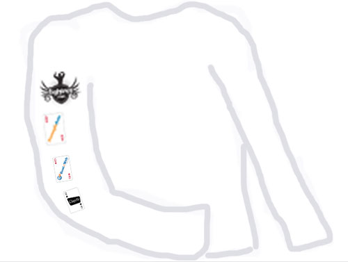
Should the sponsors logos be down the arm?
This is just a fast crummy drawing to give you the idea.
Click Here to take survey
YES SERIOUSLY – PLEASE GO TAKE THE SURVEY – 15 SECONDS!




I would go with the Black Shirt. The table “green” looks better. Yes to spade logo on the front. Yes to sponsors and on sleeve. But I would add the Girls like on the 2007 shirts. That was a nice touch. Maybe mix them up. 2 Sponsors & 2 Cards the mix it up on the other sleeve.
Sorry I won’t be there. Good Luck with the event. My wife will be within the time frame to have the baby. But let me know how much I can buy my shirts for.
ReplyHey Myron,
ReplyI am still sorry you won’t get to make it.
Werewolf will never be the same!
I am not sure if we will have any left over.
Fire me an e-mail after pubcon and I will see if I have any left.
Good luck with the baby!
I don’t care what the color is but I’m BEGGING for a short sleeve version. Heck, I’d buy a few; the long sleeve ones are nice, but even in Chicago, it’s only a 4-5 month shirt.
Thought it was worth throwing in my .02.
ReplyI really like the olive one myself
ReplyThe emblem on the chest and the other on the back would look better. Either White or Black works.
ReplyWhoops. I agree with the short sleeve.
ReplyI like the asphalt colored shirts. I also think you should put the logo on the front and the advertisers on the sleeves. However, I agree with Dan, I would prefer a t-shirt since I’m living in Texas 🙂
ReplySWEET graphic! I like the asphalt color shirt. I definitely would like to see the emblem on the chest and I’m indifferent on the sleeves.
ReplyI definitely like the blue one. Advertisers on the sleeves are definitely cool.
ReplyFirst off, my vote: ASPHALT
I just found out about and will likely make it to the tourney. I just have to add a night to my stay and change the flight.
As far as the “networking” aspect of the tourney: Are there any big names (other than yourself of course) signing up? Like any of the speakers at pubcon? Please let me know!
ReplyThese look awesome dk – Any of them are gonna be hot.
Replyi’m pulling for asphalt. and logos on the sleeve
ReplyI hope that girl knows that her Ace of Hearts is stuck in between her massive cleavage. I love the black shirt, black is always classy, simple, and goes with everything. And the sponsors going down the arm I thought from last year was EPIC. And not to mention American Apparel Ts are the most amazingly comfortable shirts on the planet. Good choice in shirt selection.
Reply